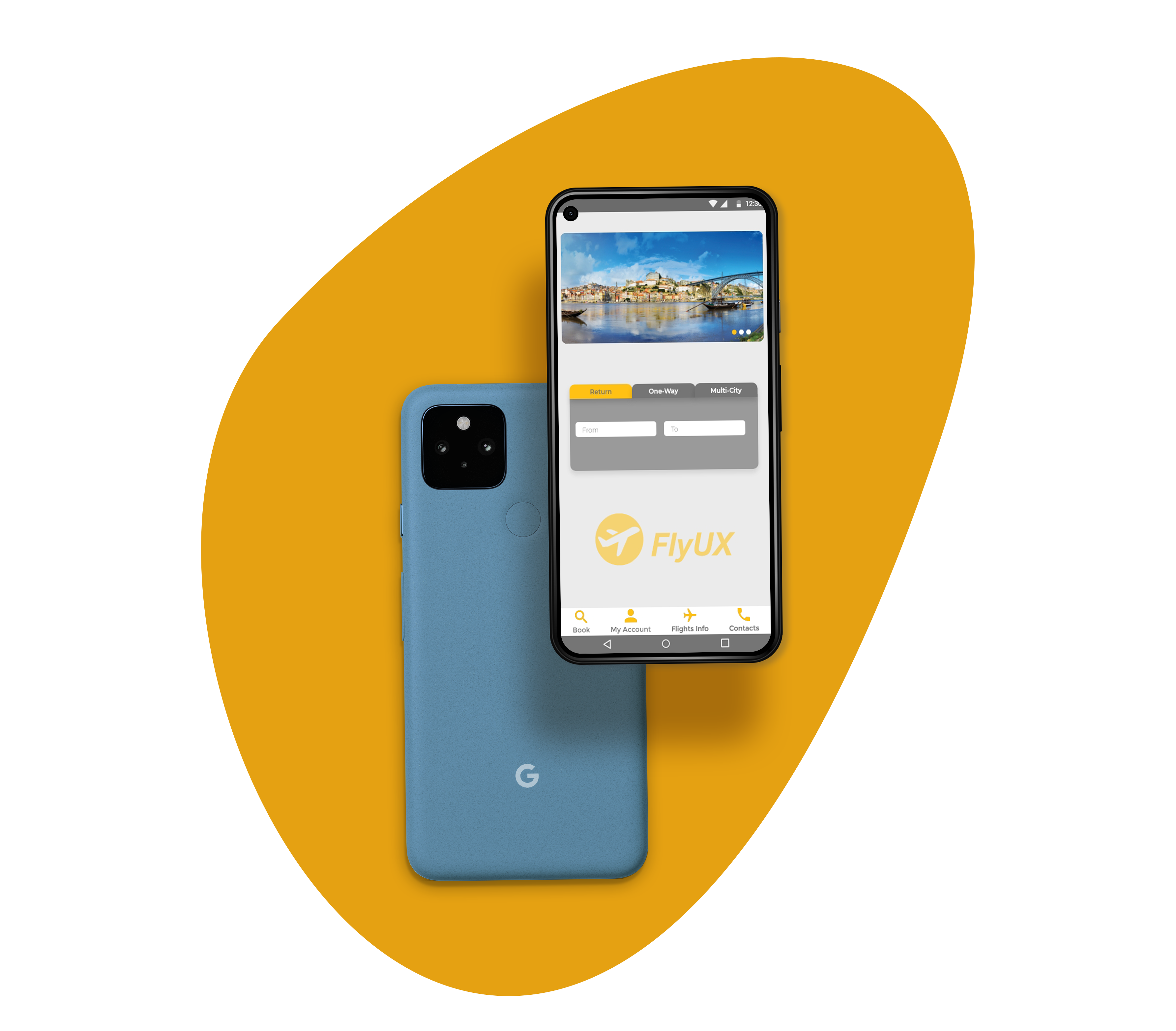
Fly UX Mobile App
How to optimise the booking process of an airline?
How to optimise the booking process of an airline?
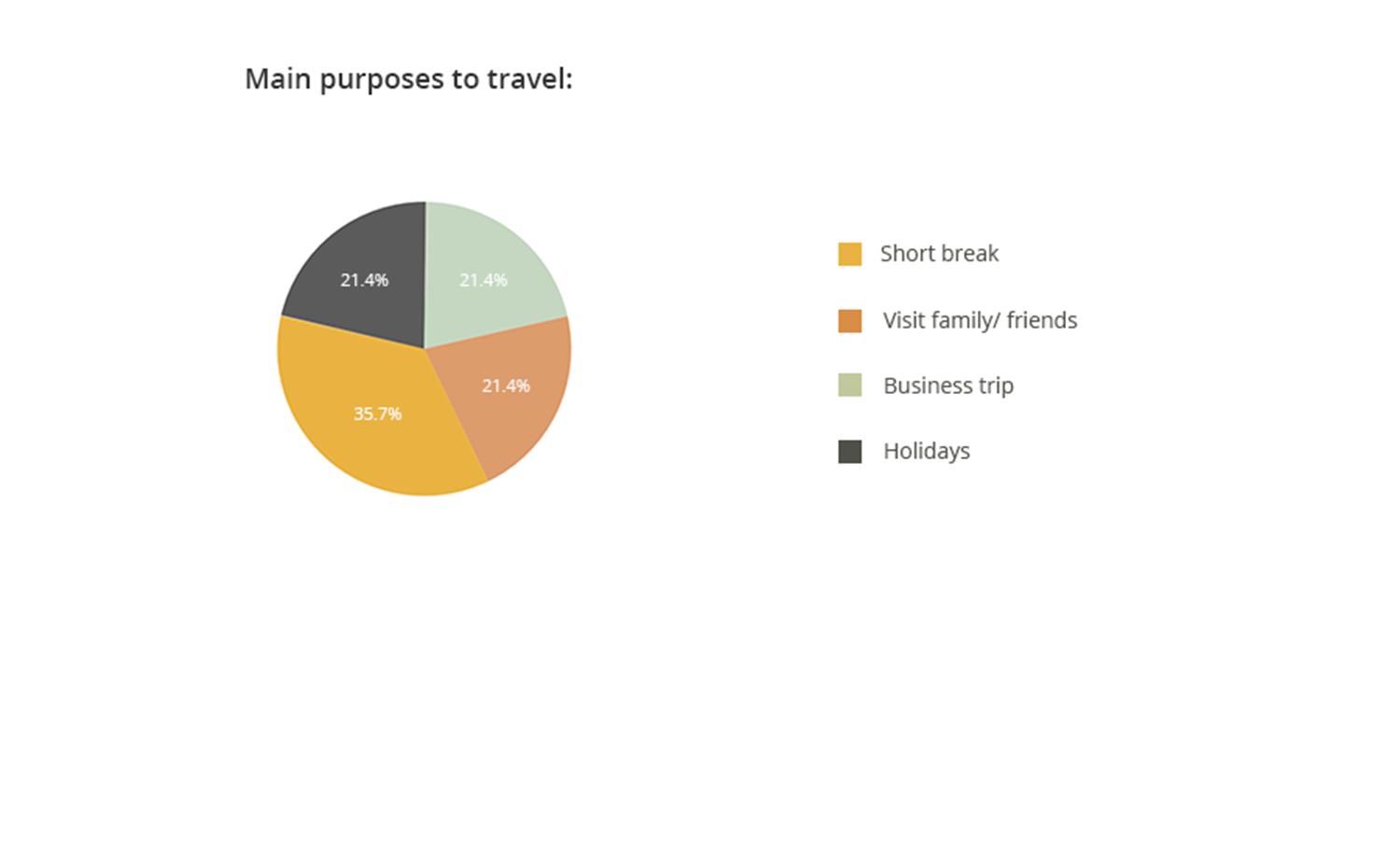
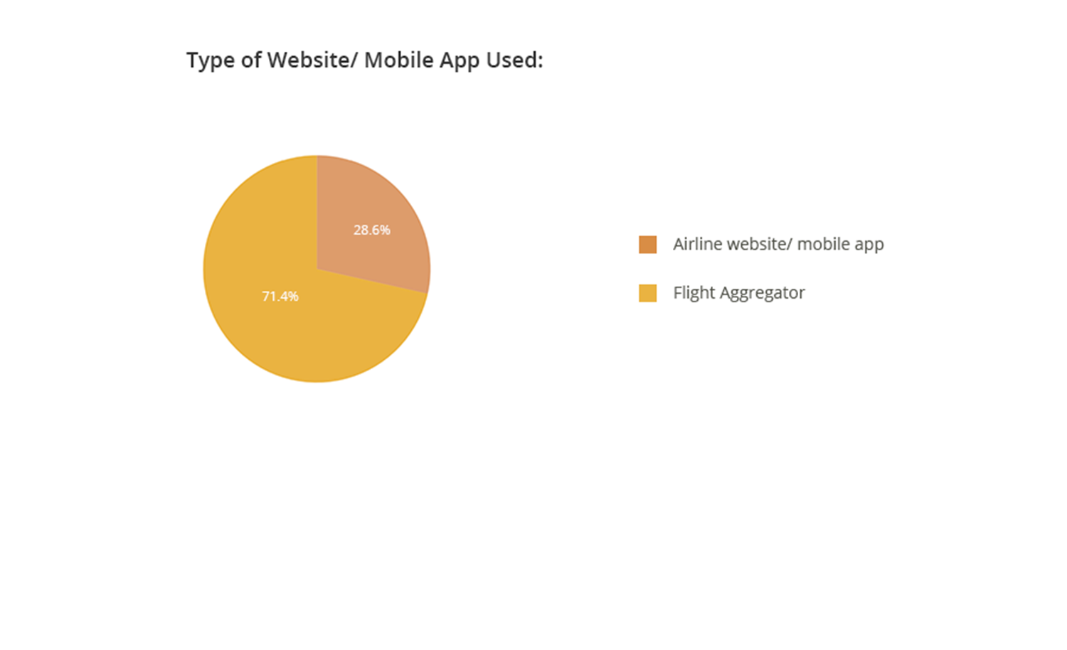
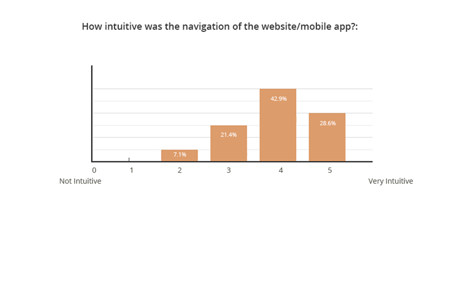
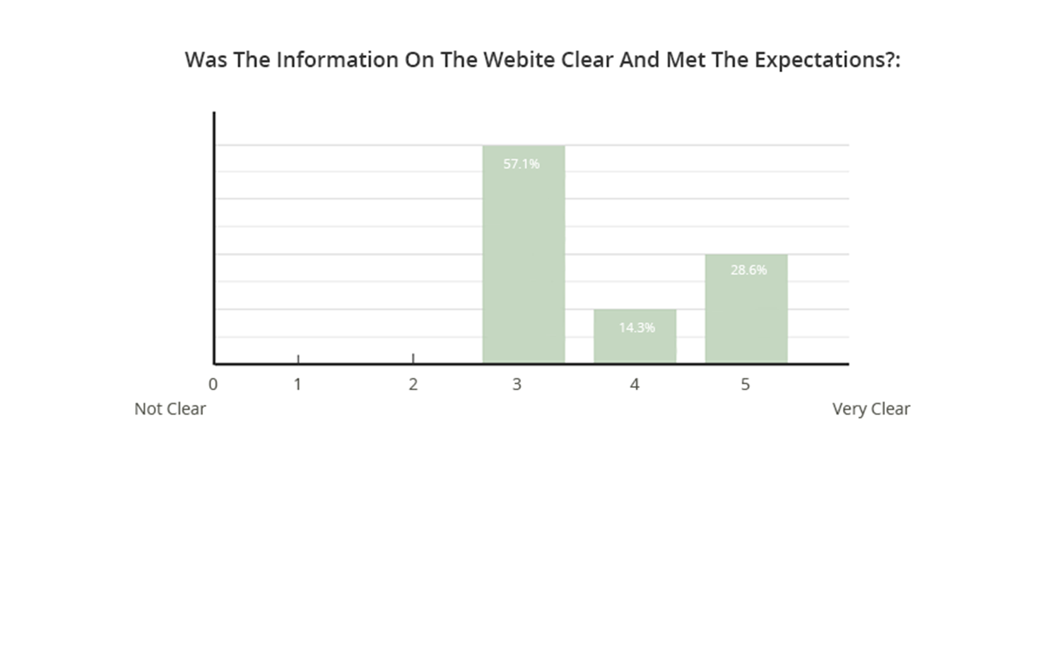
Using online surveys proved to be a quick and efficient method to explore what influence a user to use an airline mobile app or website and understand their pain points.
I collected approximately 21 responses, with the inquiries primarily centered on participants' usage patterns, motivations for using such websites/mobile apps, preferences regarding the type of websites/mobile apps they utilize, and their overall experiences with these platforms.
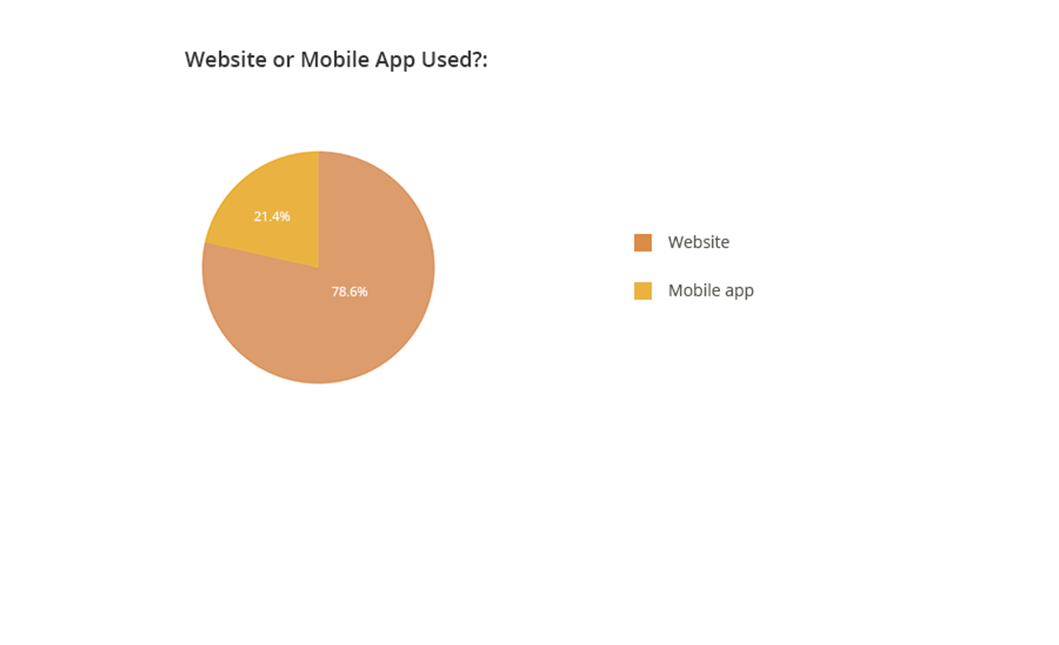
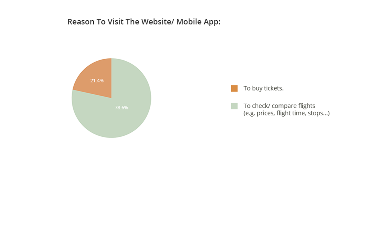
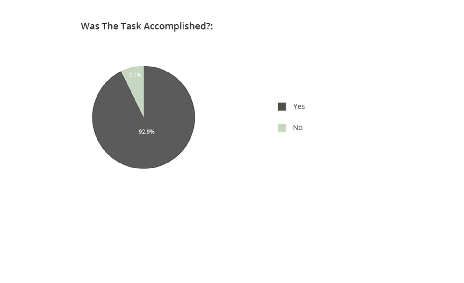
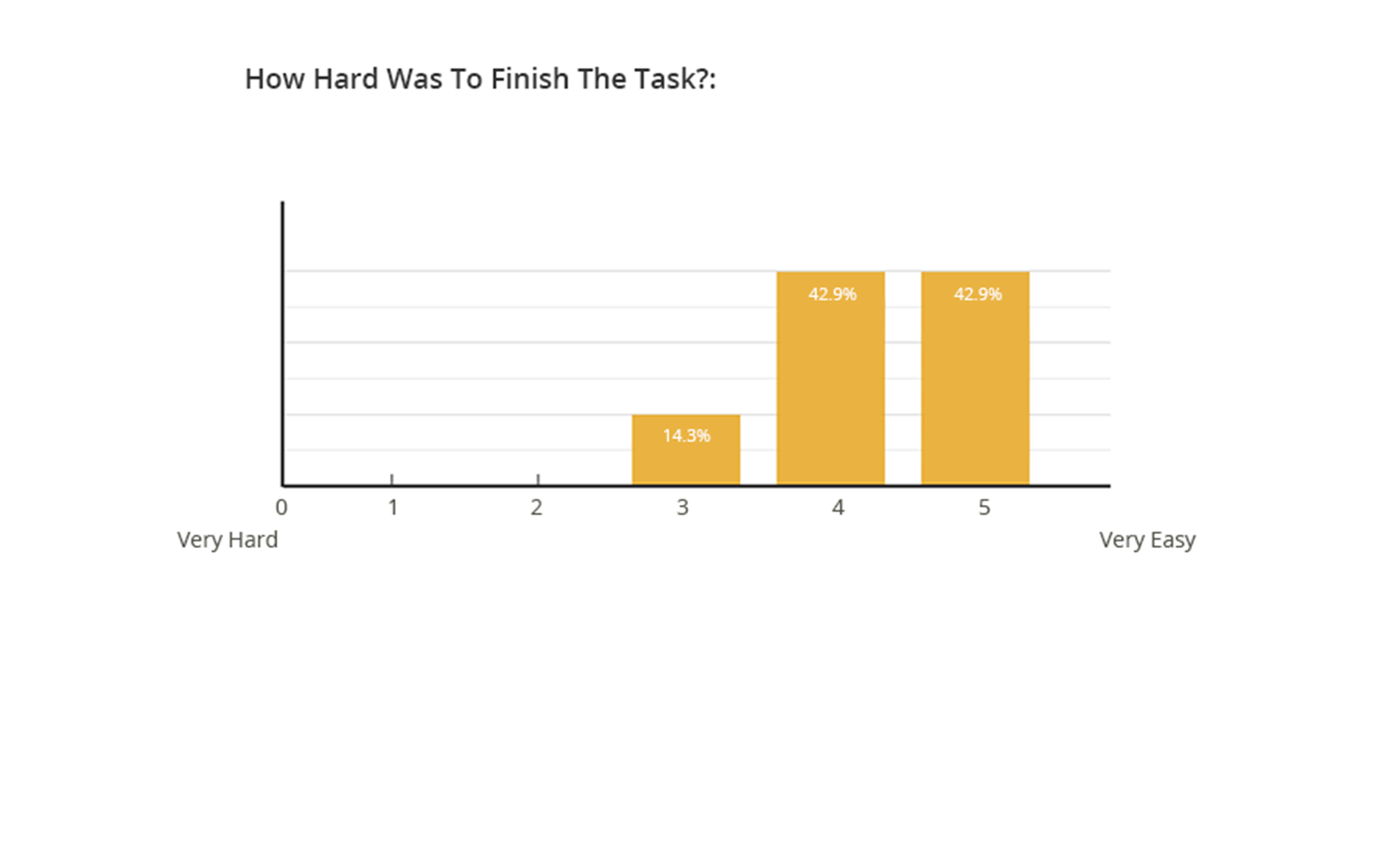
Survey Highlights:
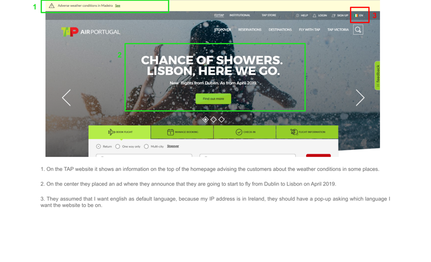
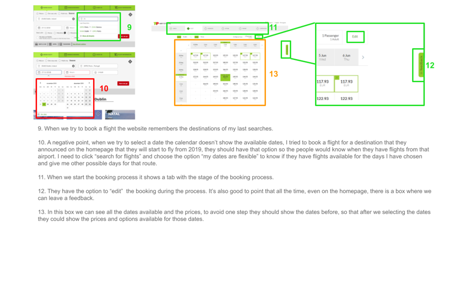
Competitive benchmarking for airline mobile apps involves a comprehensive analysis of the features, functionality, and user experience offered by different airline applications within the industry.
Airlines utilize this strategic process to evaluate their mobile app performance against competitors, identify strengths and weaknesses, and ultimately enhance their own offering. By benchmarking against industry leaders and emerging rivals, airlines gain valuable insights into emerging trends, innovative features, and customer preferences, enabling them to adapt, improve, and stay ahead in the competitive aviation market.
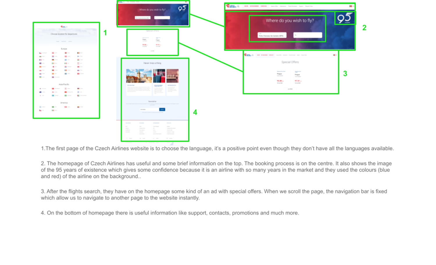
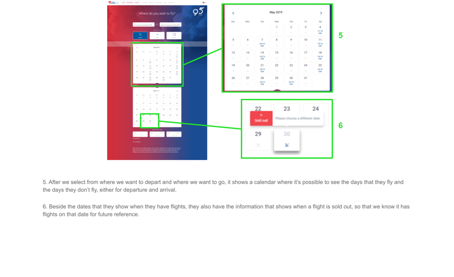
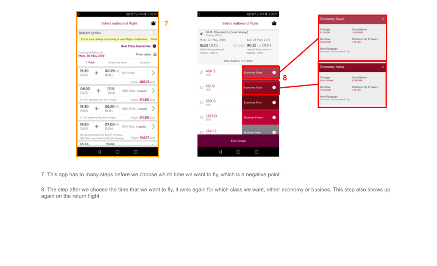
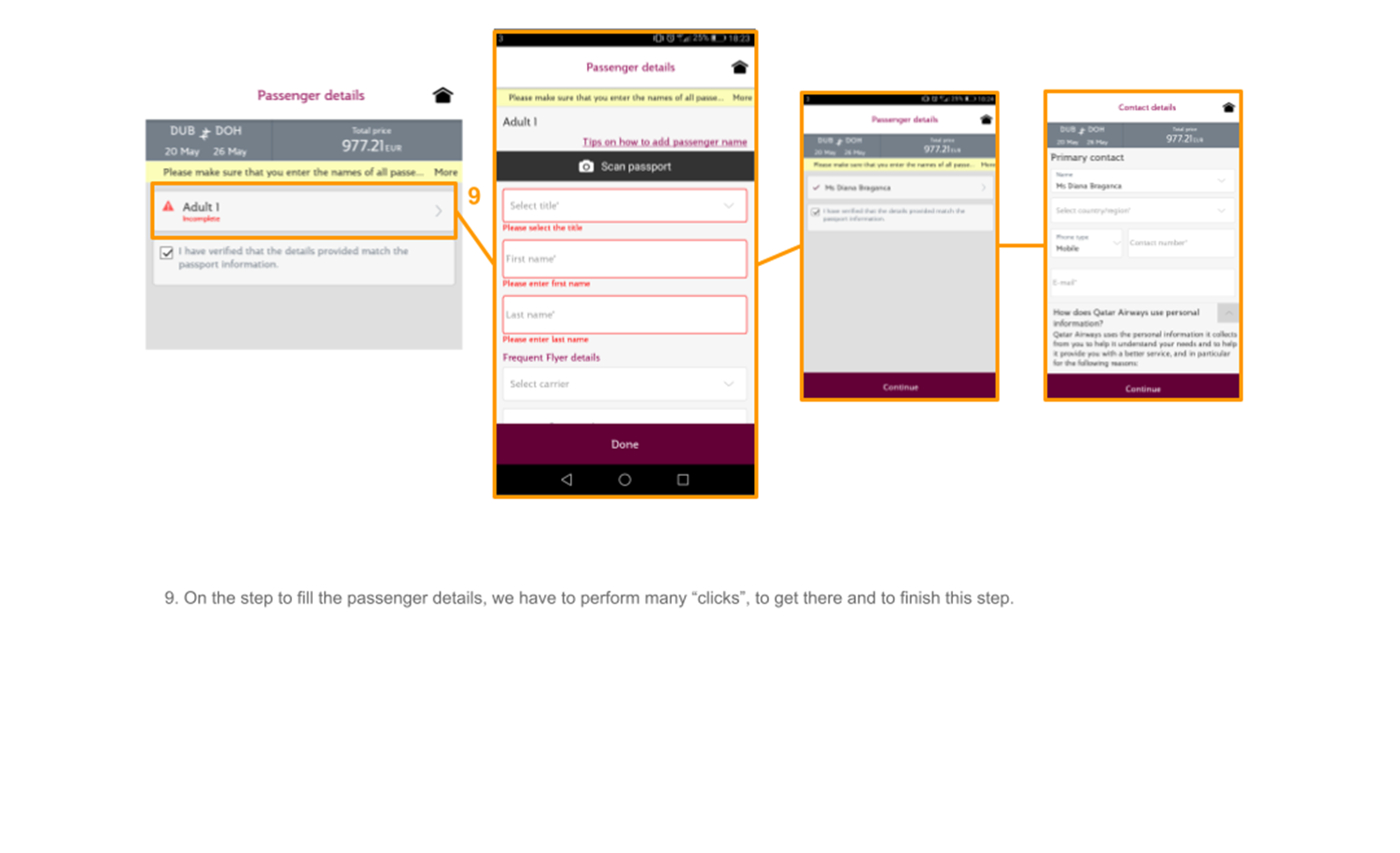
During this project phase, I've explored into the websites and mobile apps of some selected competitors to determine best practices and identify areas for improvement in the booking process. TAP and Czech Airlines were explored for desktop website analysis, while Qatar and Etihad provided subjects for mobile app exploration.
I strategically used a color-coded system to pinpoint the best and worst practices for the selected websites and mobile apps. The red was used to mark the aspects that require improvements, orange for elements considered acceptable but in need of improvement, and the green to highlight commendable practices. This methodical approach not only facilitates a clear determination of competitors but also provides a visual guide for prioritizing improvements and implementing effective strategies for our own platform.
In the context of our airline booking process case study, user interviews and depth interviews emerge as indispensable tools for gaining insights into user experiences and preferences.
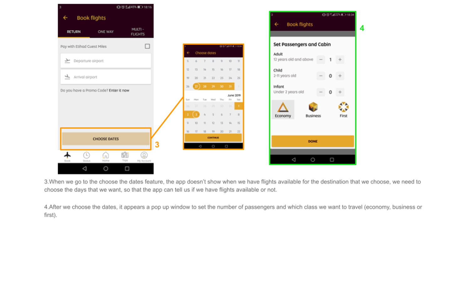
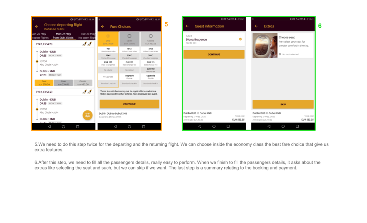
The usability testing took place using competitors' mobile apps, as this project started from the scratch without a prototype or prior version for testing. Participants performed a booking task across different mobile apps to get more insights from distinct airline experiences. Throughout the usability tests, participants revealed both pain points and positive aspects encountered while completing their booking tasks.
During the depth interviews, participants revealed a common practice of initially searching for flights on websites to conveniently compare different airlines and dates. Post-purchase and check-in activities were reported to be more frequently conducted through mobile apps, emphasizing a distinct user behavior pattern in the flight booking process.
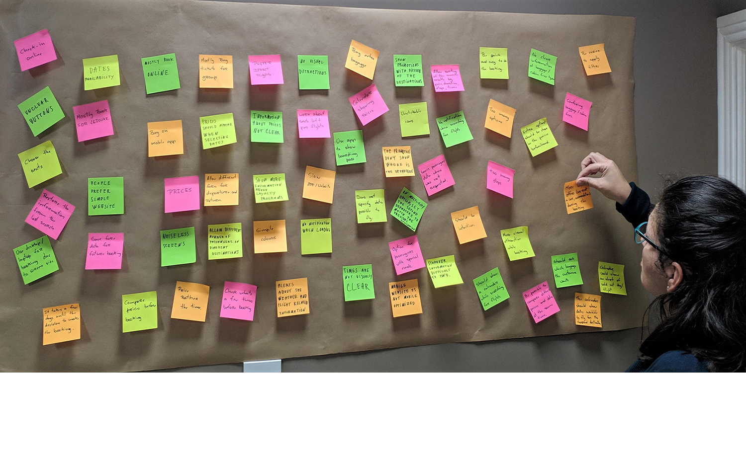
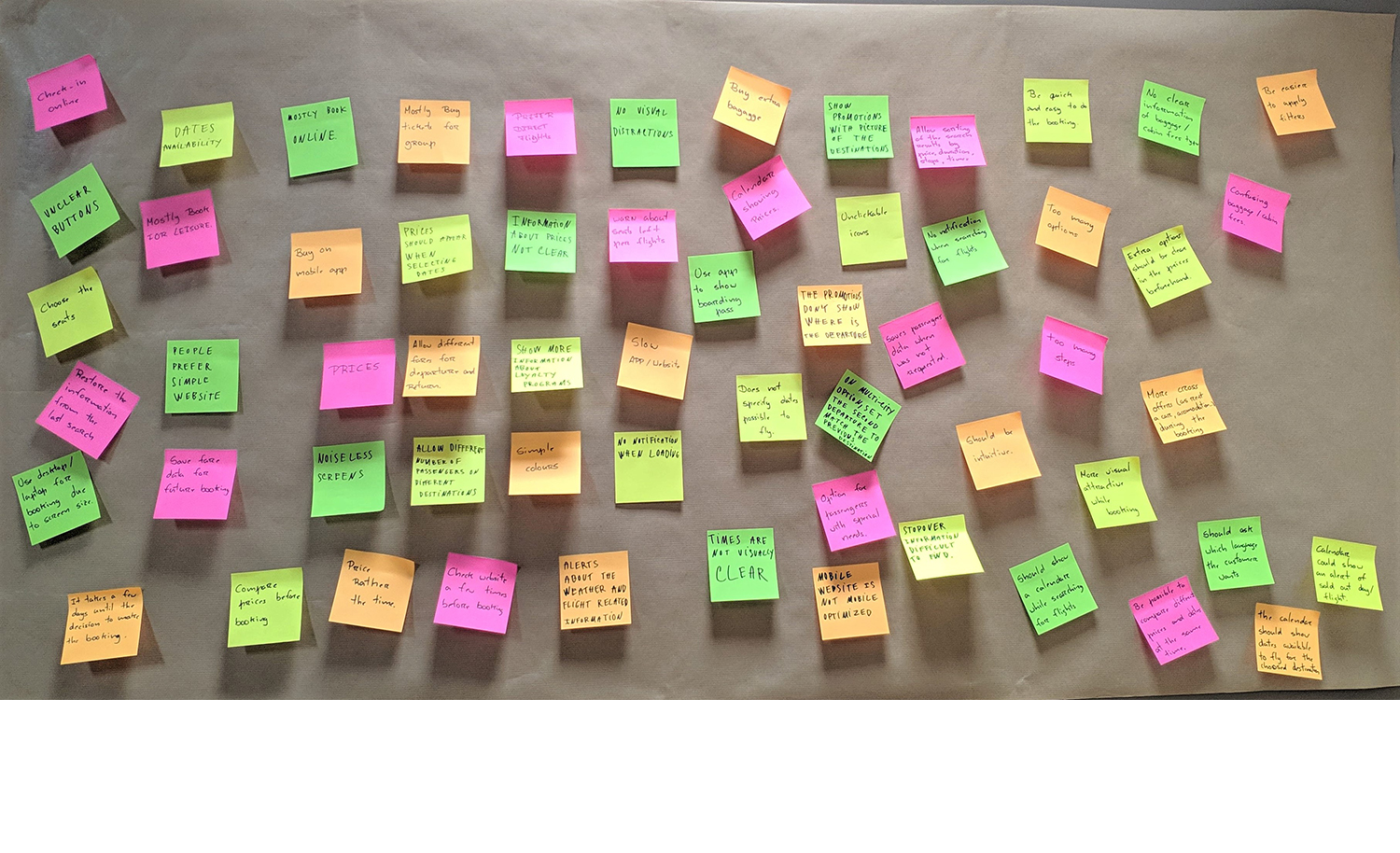
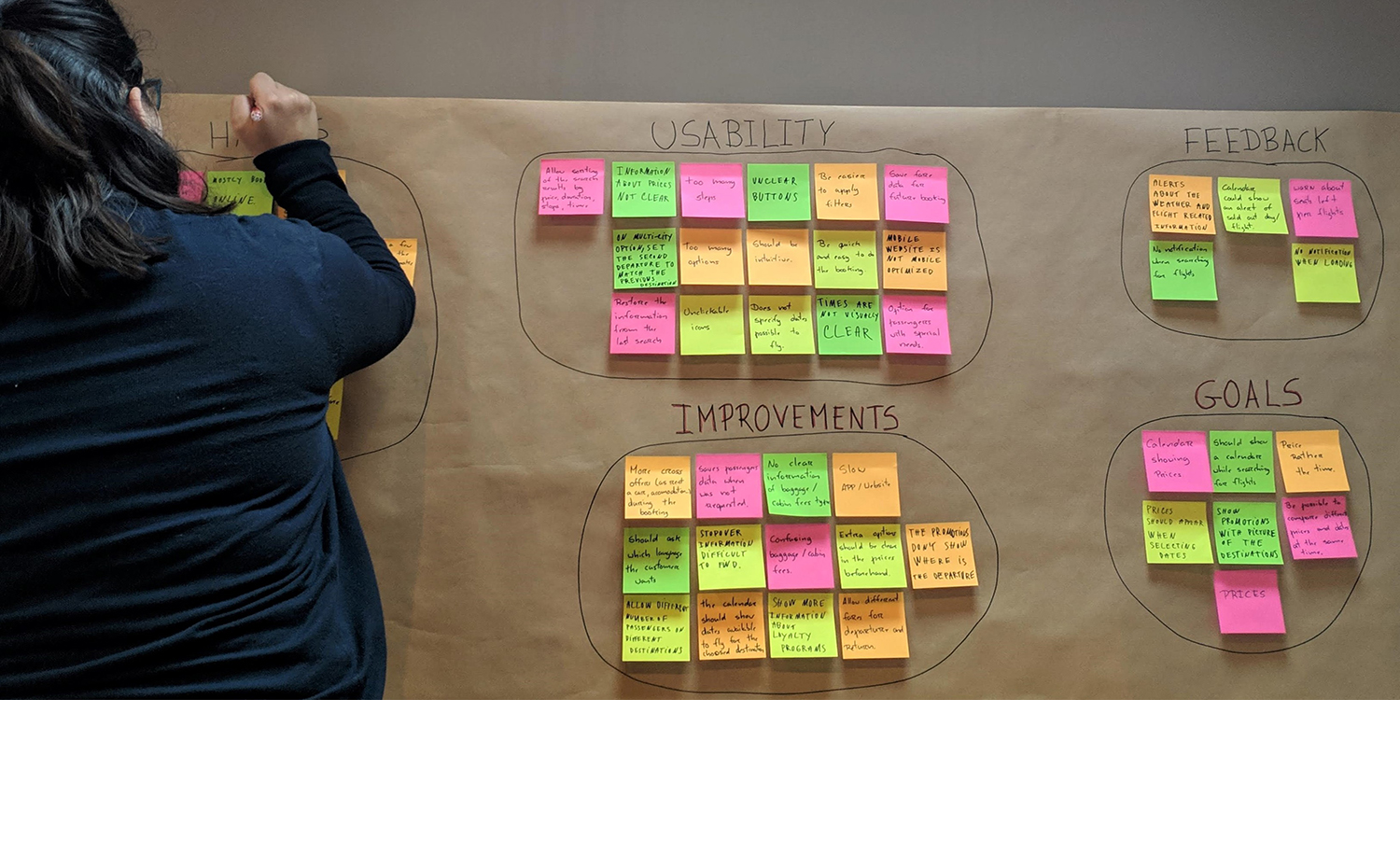
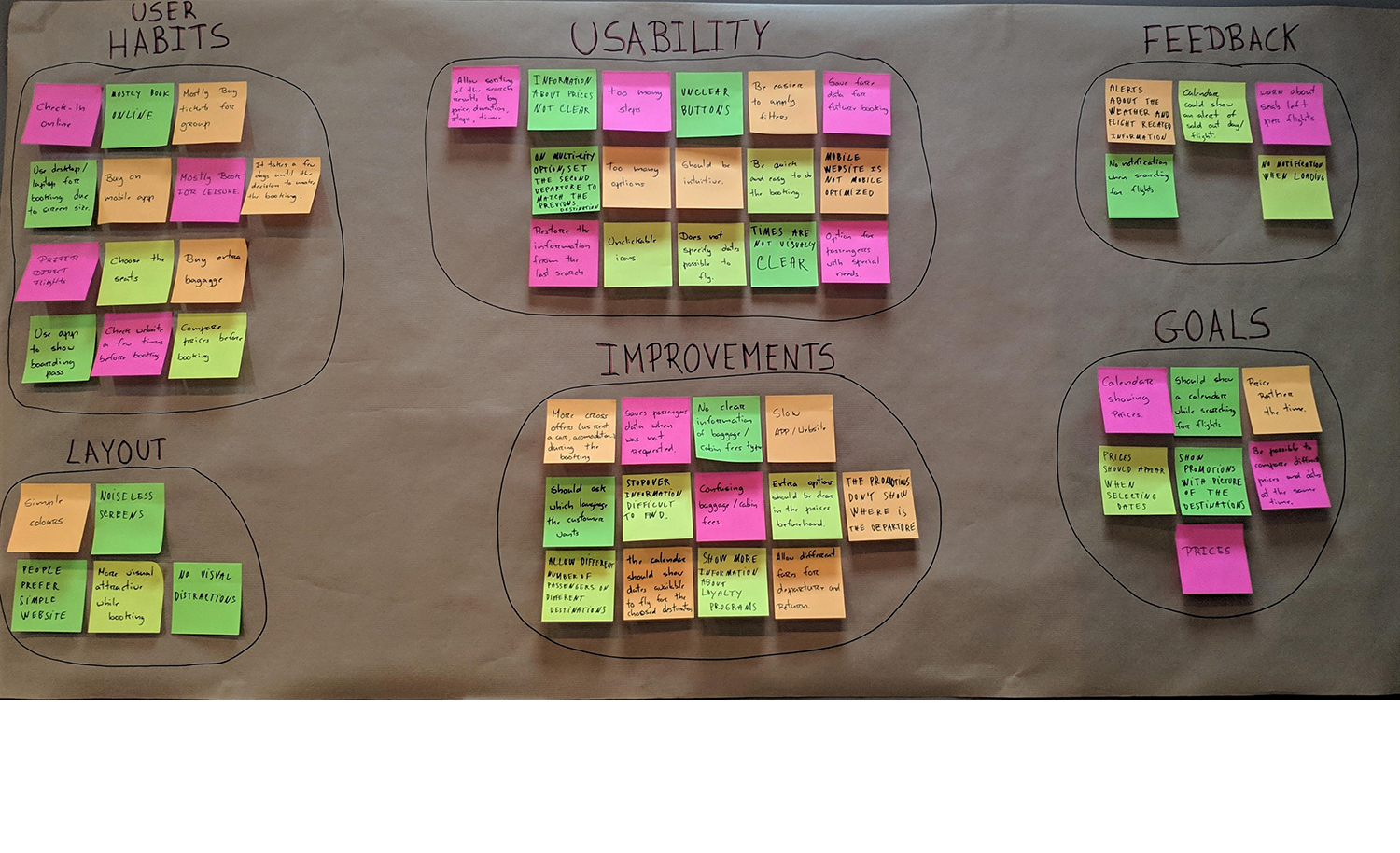
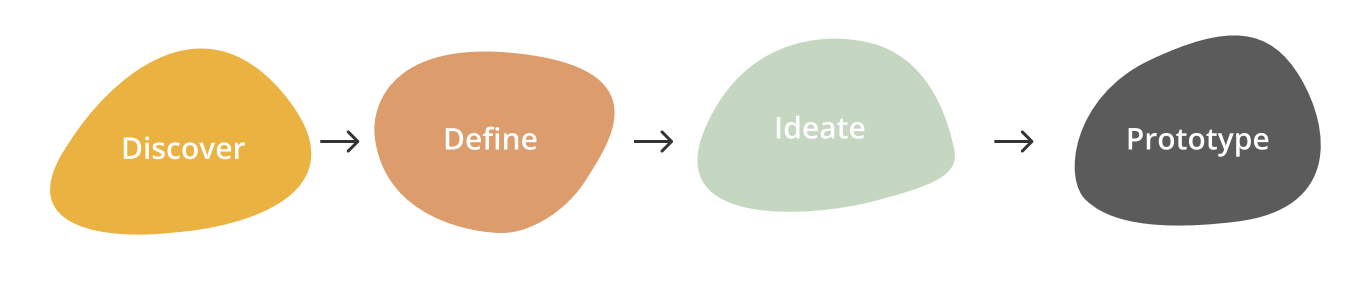
The Affinity Diagram is part of the Define phase of my UX process. During this phase, the information gathered from user research, interviews, and usability testing was analyzed and organized into an affinity diagram, specifically focusing on the booking process.
This visual representation allowed me to identify patterns, common themes and pain points within the user journey.
By collecting insights together, the card sorting facilitates the understanding of the challenges and opportunities implicit in the airline booking experience.
This process not only helps refine complex data but also helps the entire project to prioritize issues and defining key objectives for the next phases of the case study.

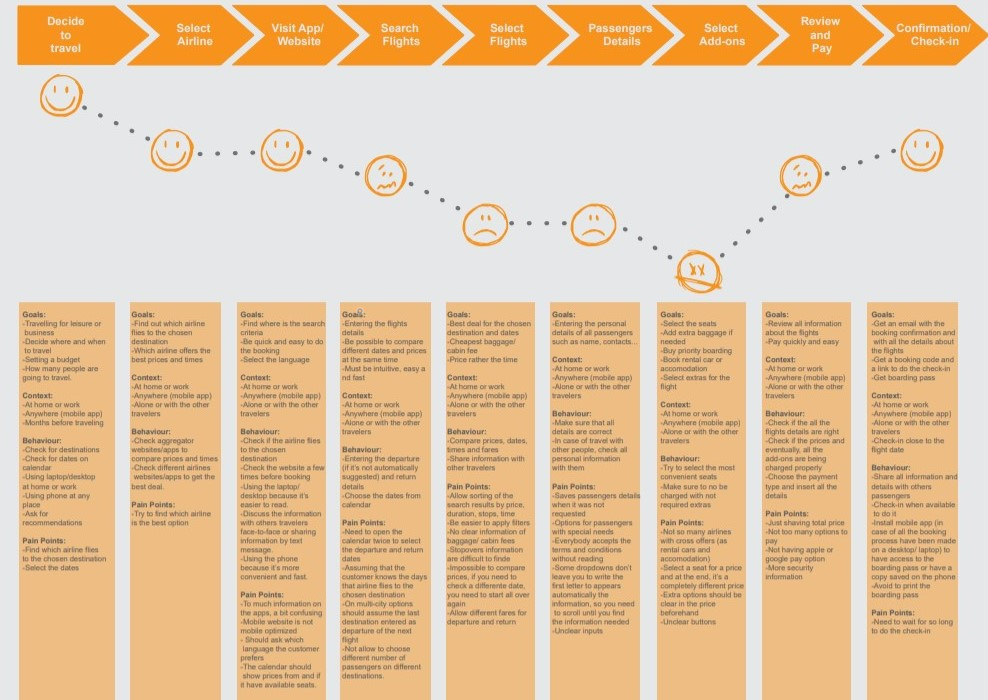
Creating a User Journey allowed me to use all the information gathered during the card sorting and add more structure to my research data. This User Journey Map represents the entire experience a customer has while booking a flight.
With this map, I was able to understand that the booking process doesn't start on the website or mobile app, it starts since the moment the user has the intention to travel.
While creating this visual representation of the user experience, I was able to pinpoint their goals, behaviors, the context, and the pain points encountered by them in each step of the booking process.
This map will help me to make the right decisions later in the project and to not forget what the customer needs.
The flow diagram provides a clear and concise view of the product, making it easier for any person to understand the structure and flow of the process.
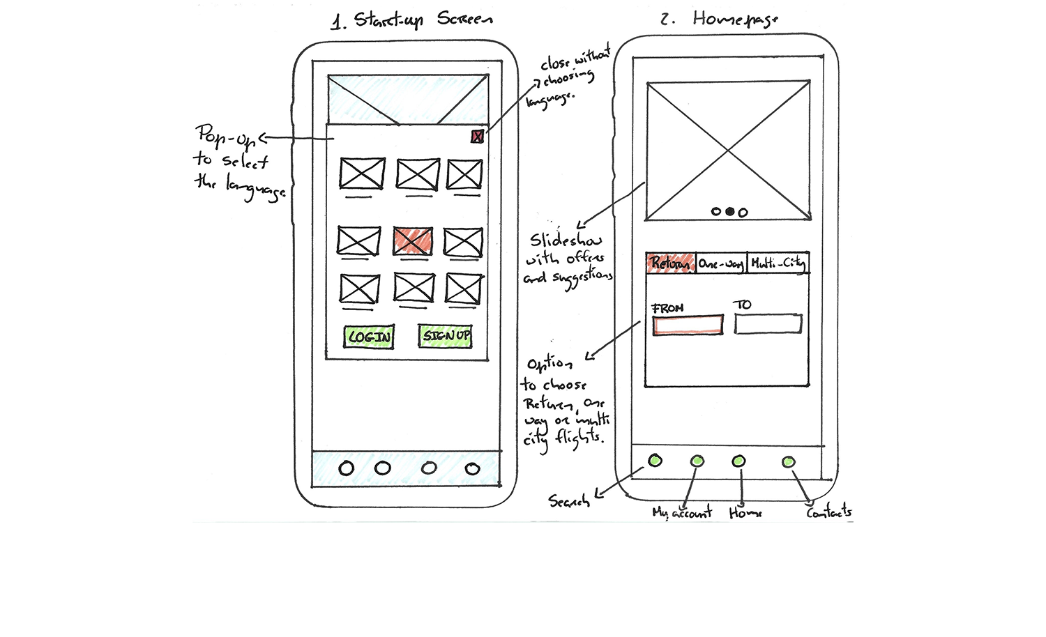
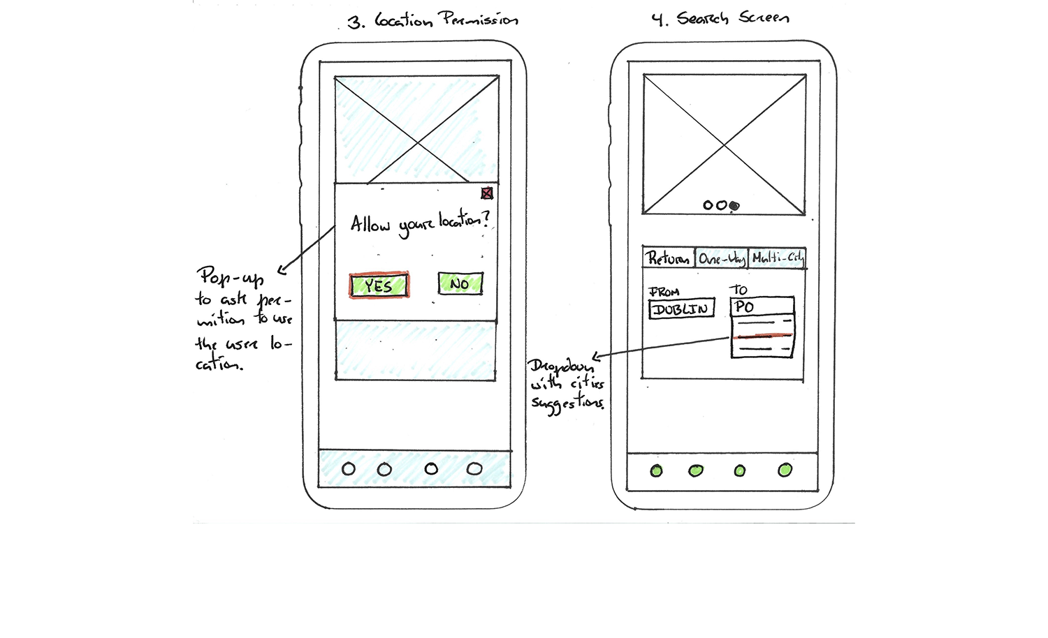
At this point, the structure of the product takes place. Using all the research data collected up to this project phase, I formulated and delineated the project's flow.
The flow diagram made it easier to pay attention to all the details and steps, enabling some adjustments to the project. My flow diagram starts with a language selection page, leading users to either the home page or the sign-up/ login section, and progresses through the entire process until the booking confirmation.
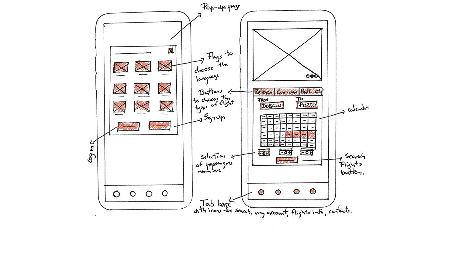
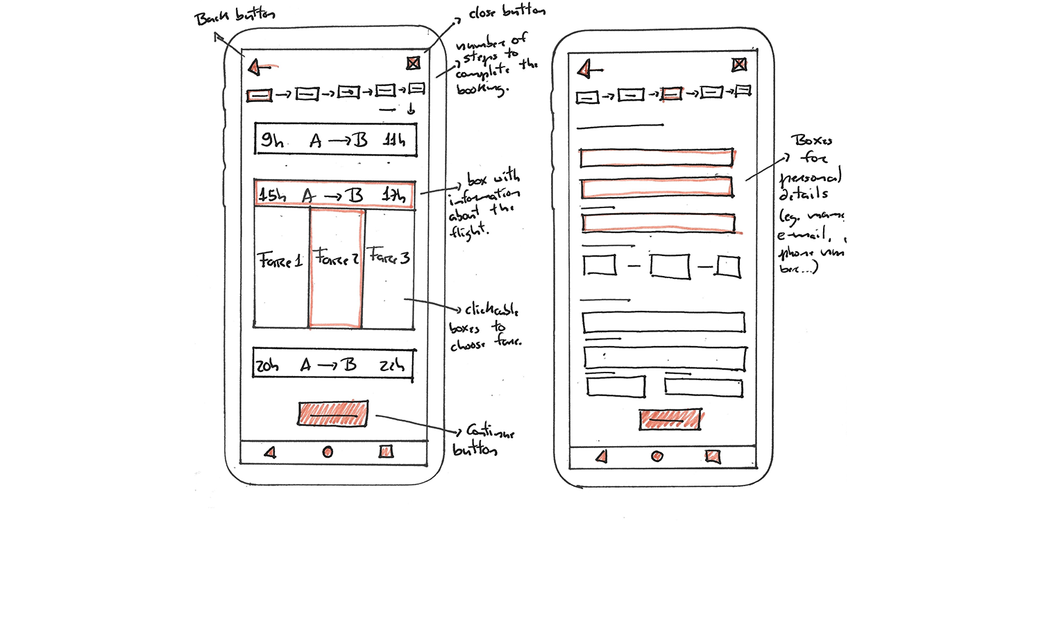
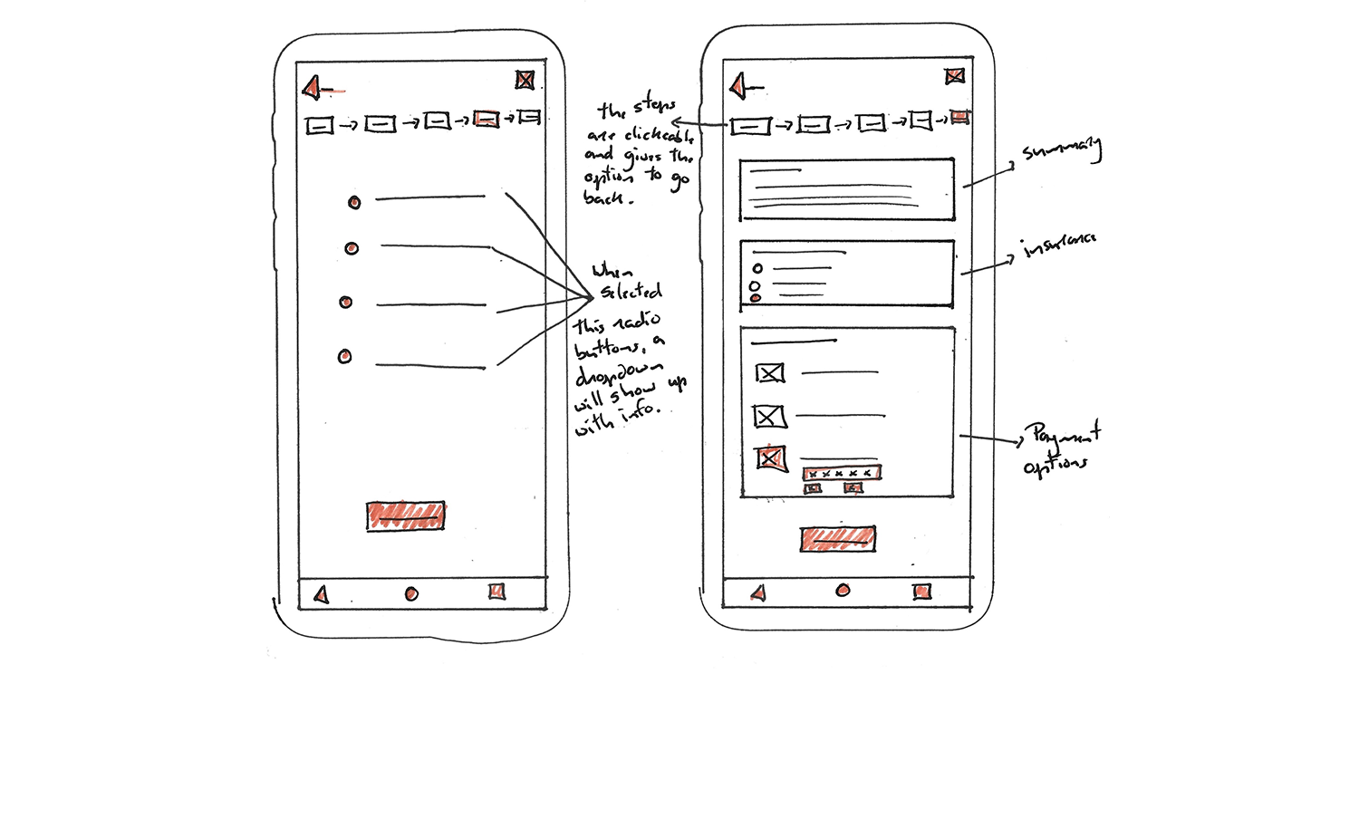
I initiated this step with rough hand-drawn sketches using what I've learned with the preceding phases of the project, and particularly following the delineation of the user flow and screen states on the previous step.
I have sketched individual screens and interactions, at this point, mainly to enhance the most important elements that should be on each screen. The objective of sketching the navigation elements is to define how each element would work and how the user will interact with them. This step helped to define the navigation style and create a pattern for similar screens.
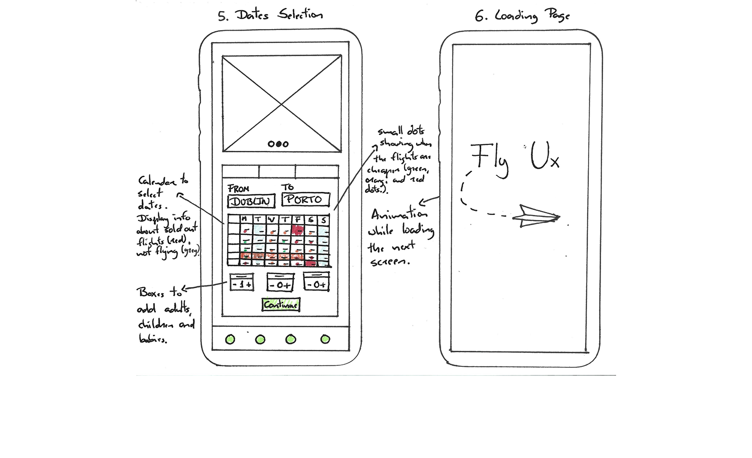
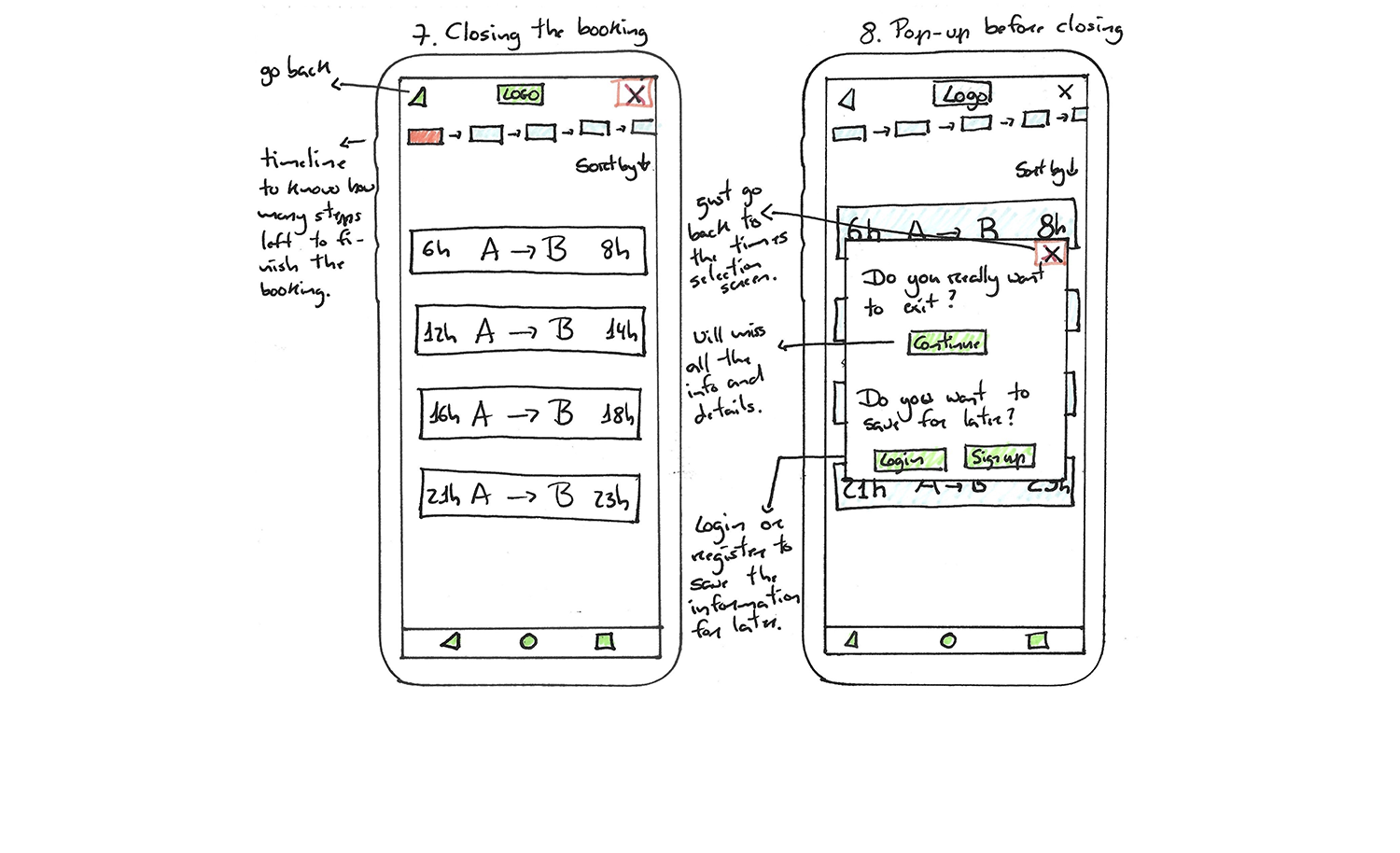
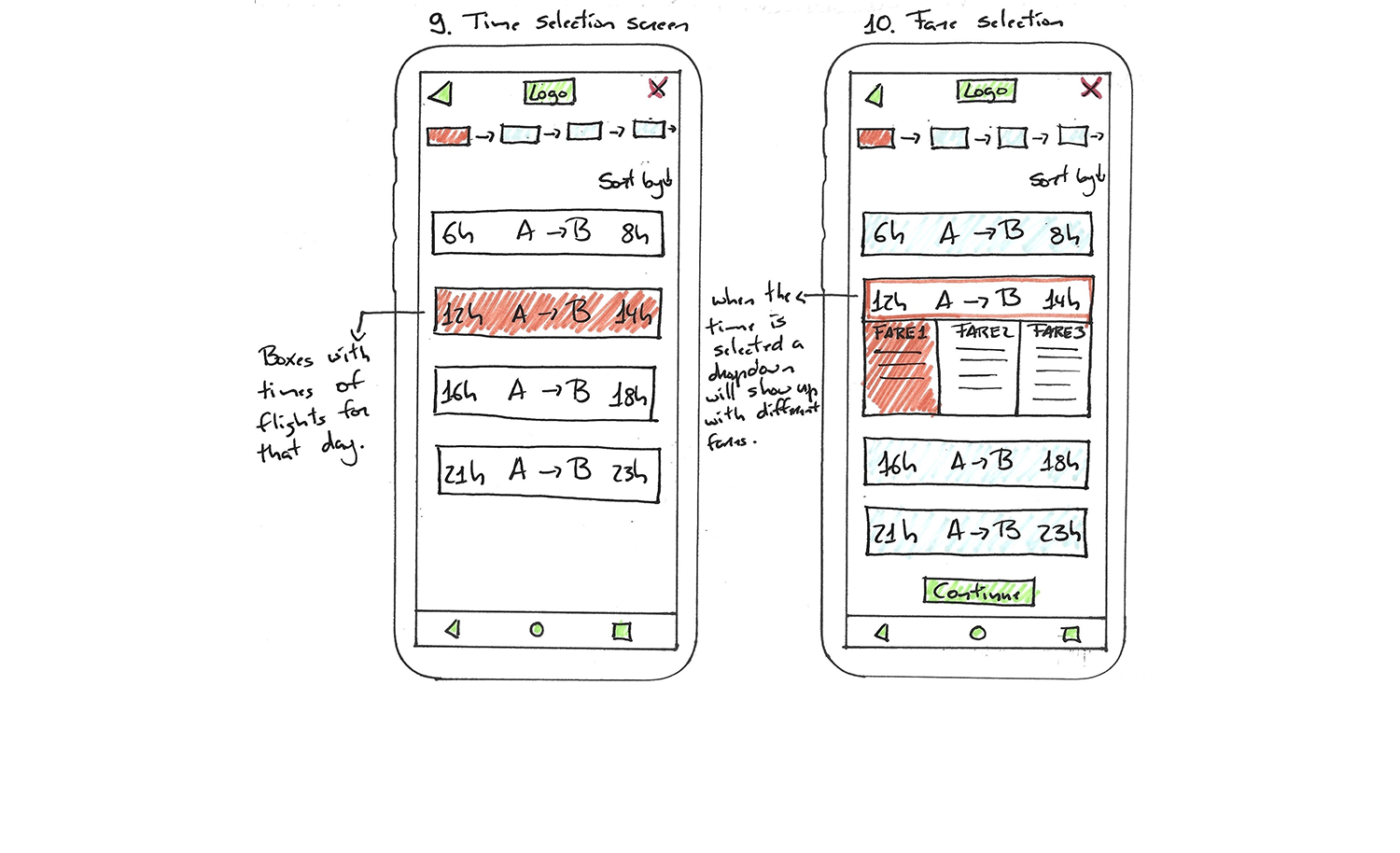
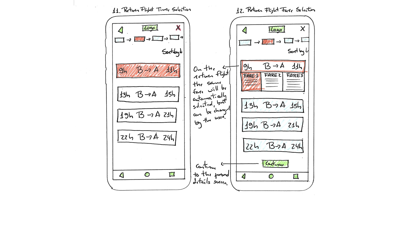
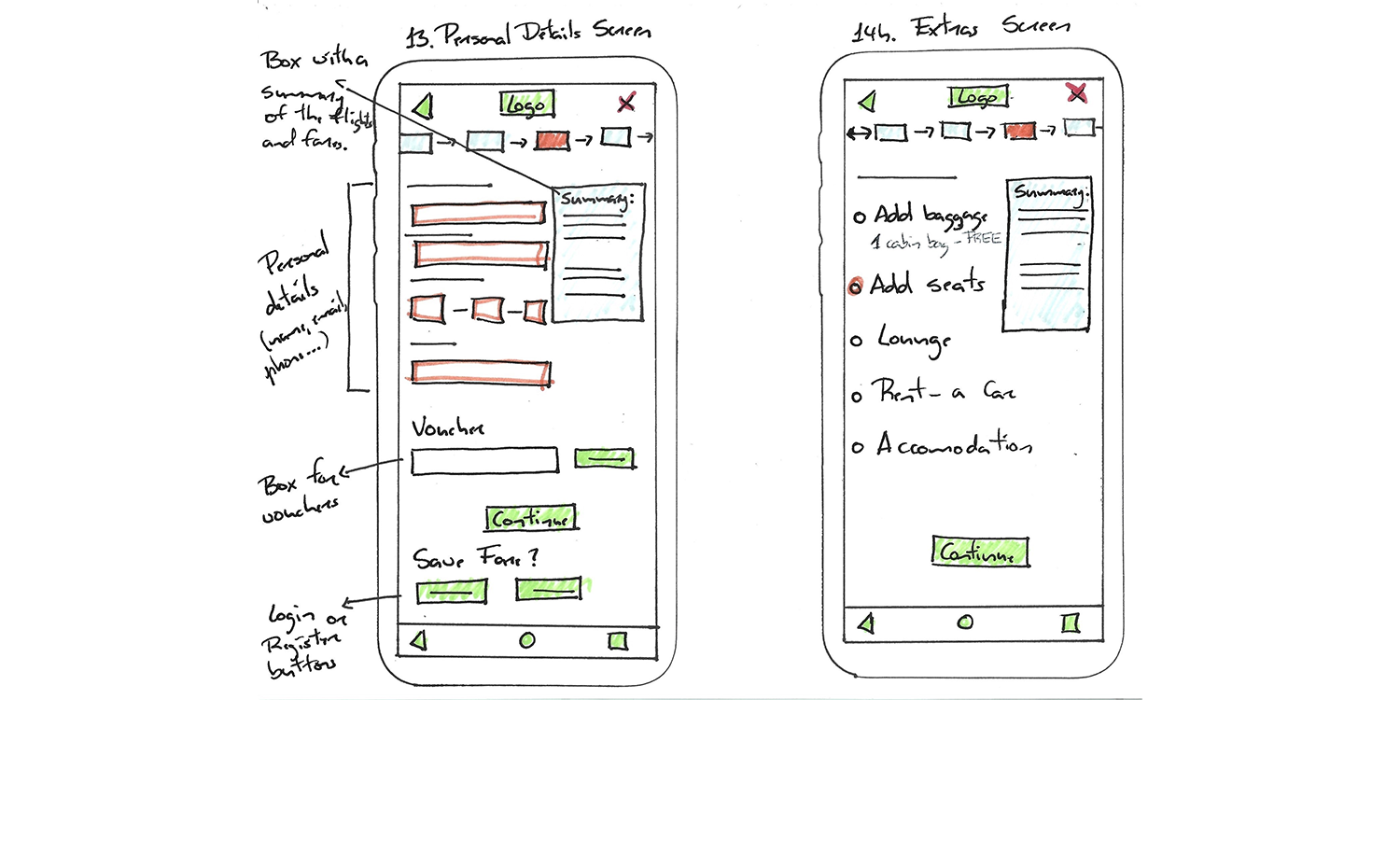
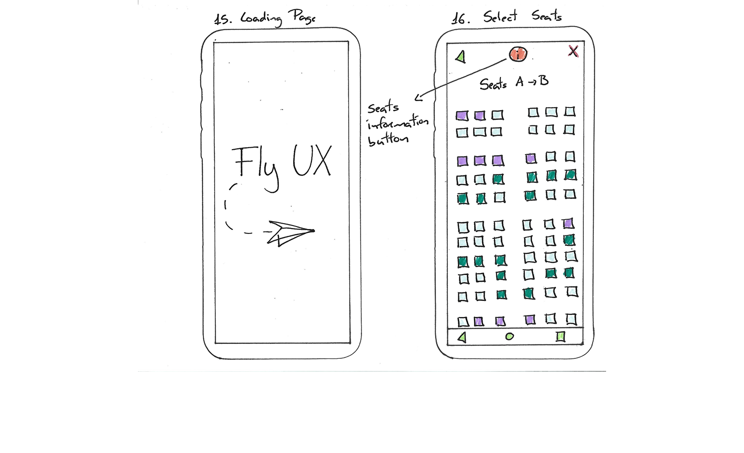
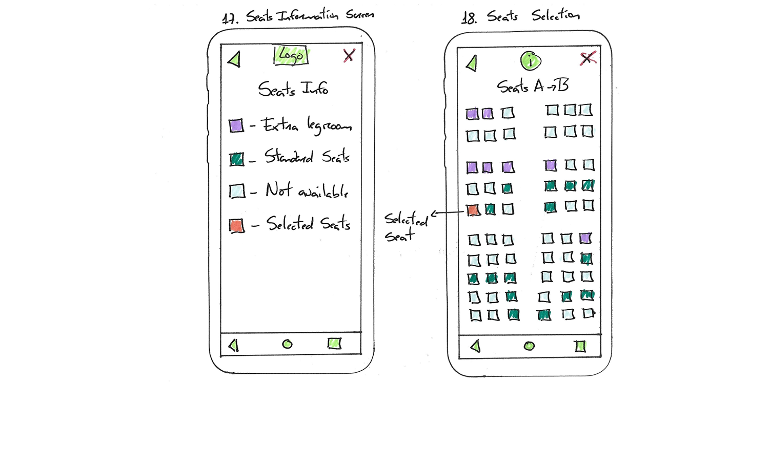
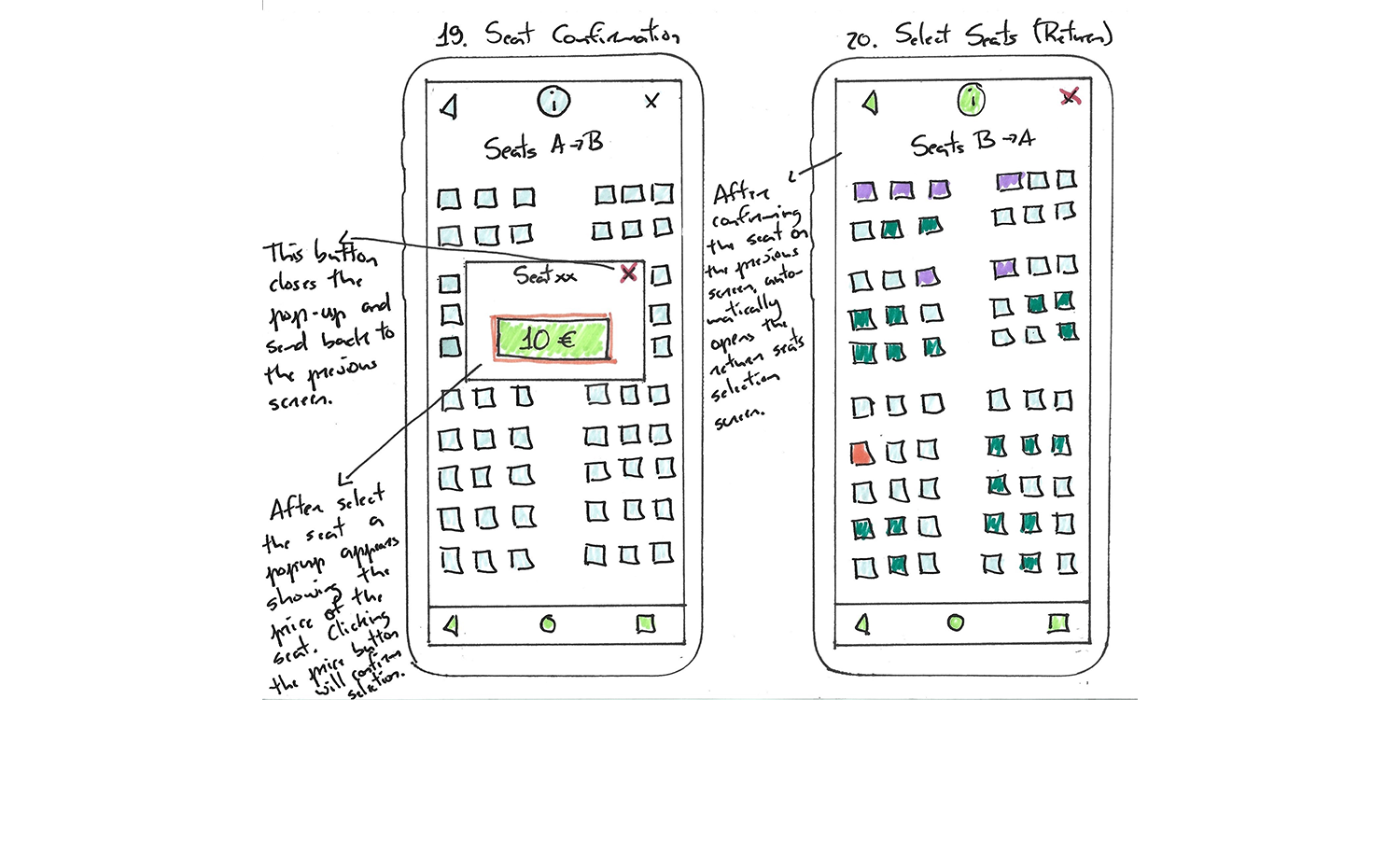
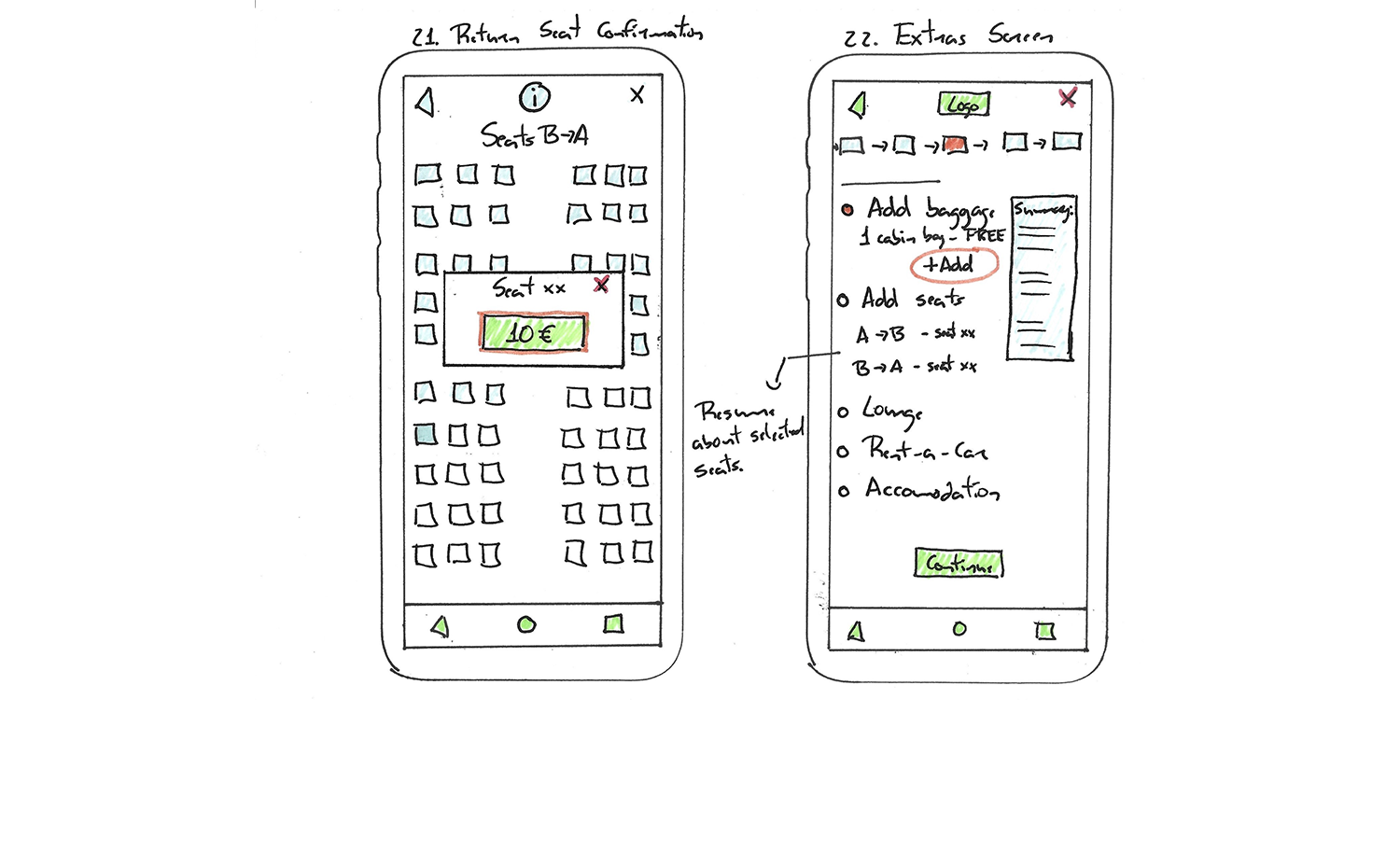
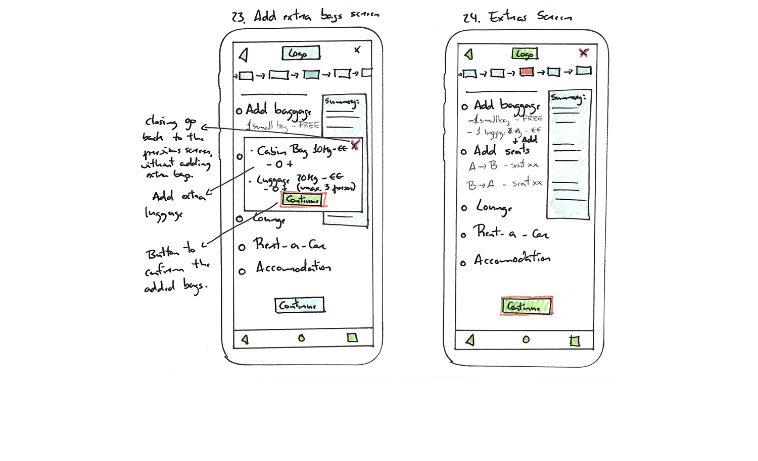
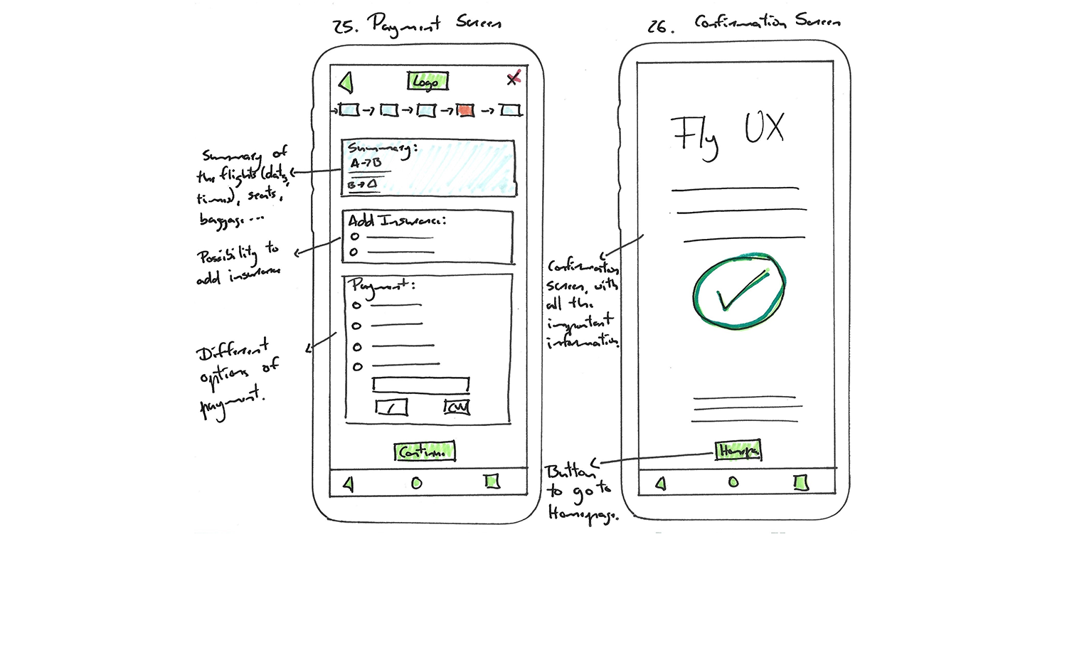
After defining the user flow and the navigation style, I hand-drawn on paper the wireframes for all the steps mentioned in the user flow. These sketches were converted to a medium fidelity prototype for the next phase of the project.
This step helped me to visualize my ideas and how they would turn out on a future prototype. With this type of wireframe, it is much easier to step back if needed.
I designed an interactive medium-fidelity prototype by using the information from the user flow and the sketched wireframes created in previous steps of the project. Although the initial instruction suggested either a low-fidelity or medium-fidelity prototype, I opt for the second option.
In this project phase, I utilized Axure RP to design a prototype showcasing one of several potential ways to book a flight within a mobile app.
This medium-fidelity prototype prioritizes functionality over visual aesthetics, focusing on essential details, interactions, screen layouts and text. The design process was streamlined, benefiting from the comprehensive steps of the booking process previously defined in the previous exercise.
This marks the conclusion of the project. A following step involves presenting a high-fidelity prototype, which will be developed post-course completion.
